
Most people are afraid of black walls. The objections come fast. It will make the room feel small. It will feel depressing. It needs too much light to work. You will get tired of it.
These objections are almost always wrong. A black room, done well, feels intimate, not small. Grounding, not depressing. And you do not get tired of it, because unlike a trend color that dates itself within two seasons, black does not belong to any era. It belongs to all of them.
A Short History of Dark Interiors
Dark interiors are not new. They are, if anything, the older tradition. Medieval halls were dim by necessity and design, their stone and timber walls absorbing light in ways that created warmth through shadow. The great libraries of the 18th century used deep greens, oxbloods, and blacks to create spaces of concentration. Victorian parlors draped themselves in darkness.
The 20th century's love affair with white walls was the exception, not the rule. Le Corbusier championed white as a moral statement, a rejection of ornament in favor of purity. Modernism embraced it. And for decades, white became the default language of sophisticated interior design.
The correction began slowly. In the 1990s, designers like Andrée Putman and Axel Vervoordt started reintroducing darkness as a design tool. Vervoordt's Kanaal complex in Belgium became a touchstone: vast spaces where exposed concrete met deep shadow, where the absence of light was treated as a material in its own right.
Now, in 2026, dark interiors are not just accepted. They are aspirational.
Why Black Works

The physics of black in interior design are counterintuitive. Black walls do not shrink a room. They dissolve its boundaries. When walls disappear into shadow, the eye cannot gauge their distance. The result is a space that feels boundless rather than confined.
This works especially well in rooms with some architectural detail. Crown molding, built-in shelves, or window casings painted the same black as the walls create a monochromatic envelope where form reads through texture rather than color contrast. The room becomes sculptural.
Black also does something remarkable with light. A white room distributes light evenly, which is democratic but flat. A black room concentrates light where it enters, creating natural focal points. A window in a black wall becomes a light installation. A table lamp in a dark room becomes theater.
The Palette Within Black
Black is not a single color. Paint manufacturers offer dozens of blacks that lean warm, cool, green, blue, or brown. The undertone matters enormously.
A blue-black reads modern and sharp. It suits contemporary spaces with clean lines and cool metals.
A brown-black reads warm and enveloping. It works beautifully in bedrooms and living rooms where comfort is the priority.
A green-black feels organic, almost botanical. It pairs well with natural wood and stone.
A pure, neutral black is the rarest and the riskiest. It can feel institutional without the right supporting materials. If you choose a true black, you need texture to save it: velvet, raw wood, woven textiles, anything that gives the eye something to rest on besides flatness.
Materials That Sing Against Black
The genius of a black interior is what it does for everything else in the room. Objects pop. Textures amplify. Natural materials reveal themselves more fully.
White ceramics against a black wall look luminous rather than plain. A brass lamp gains presence it would not have against white. A green plant becomes genuinely vivid. Even the everyday, a stack of cream-colored books, a wooden cutting board, a glass of water, takes on compositional significance when the background steps back.
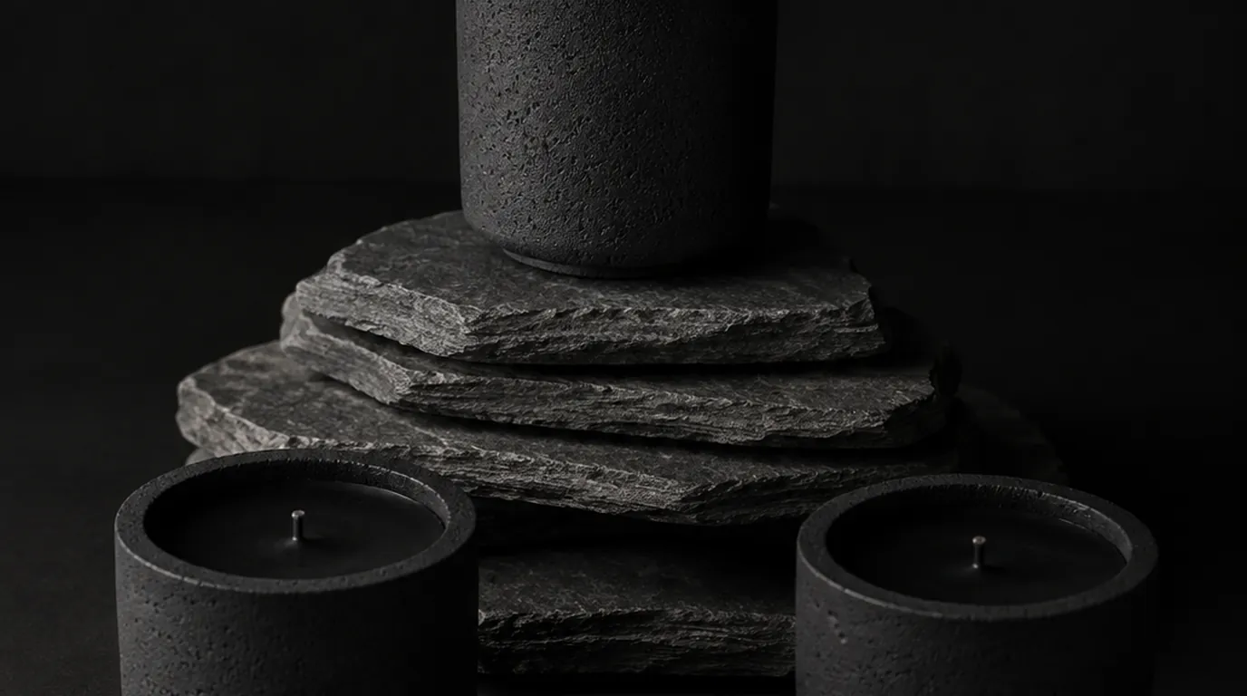
Concrete works particularly well in dark interiors. Its matte, mineral surface bridges the gap between the organic and the industrial. A concrete candle vessel on a dark shelf reads as architecture in miniature.
Linen, leather, and wool add the warmth that dark rooms need. They soften the visual weight of black and prevent a space from feeling cold. Raw wood, especially lighter species like white oak or ash, provides tonal contrast without introducing competing color.
The risk in a dark room is that every dark object dissolves into every other one. Cast concrete avoids that because the surface is porous and catches light unevenly instead of reflecting it. That is the reasoning behind 01 Andromeda, and the material is argued at length in concrete candle vessels.
Common Mistakes
Too much gloss. A black room in high-gloss paint reflects light in ways that can feel clinical. Matte or eggshell finishes absorb light more naturally and create the enveloping quality that makes dark rooms successful.
Too little texture. Black on smooth surfaces, with smooth furniture, on smooth floors feels like a void. You need tactile variety to keep the eye engaged.
Too much matching. Not everything needs to be black. The power of a dark room is in its contrasts. A few carefully chosen objects in lighter tones create the visual rhythm that makes the whole composition work.
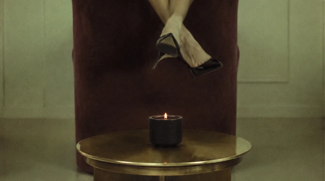
Ignoring lighting. This is the biggest one. A dark room with overhead fluorescent light looks terrible. A dark room with warm, low, layered light sources looks extraordinary. Invest in table lamps, floor lamps, and candles. Avoid overhead lighting entirely if you can.
Black candles are one of the few objects that survive this palette without being swallowed by it, which is a recent development in a category that spent decades in cream and glass. The shift is traced in why black candles are having a moment.
Room by Room
Bedrooms are the easiest rooms to take dark. You spend most of your time there with reduced lighting anyway. Black walls create a cocoon effect that actively improves sleep quality by reducing visual stimulation.
Bathrooms in black feel luxurious, especially small ones. A dark powder room with a warm-toned mirror and a single candle creates a vibe that no amount of white subway tile can replicate.
Dining rooms become theatrical. A dark dining room with candlelight transforms an ordinary meal into an occasion. The food looks better. The people look better. The conversation deepens.
Living rooms require the most careful balance. They need enough light sources and enough material variety to prevent the black from becoming oppressive during daytime hours. But when it works, a black living room becomes the kind of space people remember.
Kitchens in full black are striking but require commitment. The alternative, a black accent wall or black cabinetry against lighter countertops, is often more livable.
The Emotional Architecture
There is a reason that the places we go for intimacy tend to be dark. Restaurants dim the lights. Theaters go black. The best conversations happen after sunset. Darkness removes distraction. It focuses attention inward. It creates a container for presence.
A black room does this at home. It says: the world outside is loud, and this space is not. Sit down. Stay a while. Pay attention to what is directly in front of you, because the walls are not competing for it.
That is not a limitation. That is a gift.
Lyra's 01 Andromeda was designed for dark spaces. Black wax, black concrete, a flame that looks its best when the lights are low. lyracalifornia.com.